
The CSS Trick That Finally Lets display: none Have a Graceful Exit
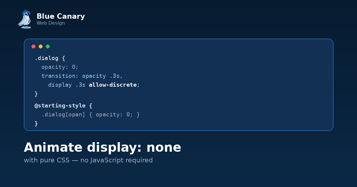
Every developer has been here. You build a modal, a toast notification, a dropdown, whatever, and you want it to fade out nicely when it closes. So you set opacity: 0 with a transition, feel very pleased with yourself, and then discover the element is still sitting there, invisible but fully present, blocking clicks and confusing screen readers, because you never actually removed it from layout.
So you add display: none to really finish the job. And the fade instantly breaks. The element just vanishes, no transition, no fade, nothing. All that nice easing you wrote gets completely ignored.
This isn't a bug. It's display doing exactly what it's supposed to do, and up until fairly recently, there was no clean CSS-only fix for it. You needed JavaScript to delay the display: none until after the fade finished. Now you don't.
Why display refuses to transition
Most CSS properties you animate, like opacity, transform, or color, are interpolable. The browser can calculate all the in-between values: 0.8, then 0.6, then 0.4, and so on. That's what makes a smooth animation smooth.
display isn't like that. There's no such thing as 50% displayed. A box is either in the layout or it isn't, so the browser treats it as a discrete property, meaning it can only be one value or the other, with no steps in between. By default, discrete properties just flip instantly at the halfway point of a transition, which for something like display: none means the element disappears from layout immediately, cutting off any opacity or transform animation still trying to play.
The fix: transition-behavior: allow-discrete
This property tells the browser it's allowed to hold off on flipping a discrete value until the transition actually finishes, rather than snapping it at the midpoint.
.toast {
  opacity: 1;
  transition: opacity 0.4s ease, display 0.4s ease allow-discrete;
}

.toast.hidden {
  opacity: 0;
  display: none;
}
Add display to the list of transitioning properties, tack allow-discrete onto it, and now display waits politely until the opacity fade is done before it actually removes the element. The fade plays out in full, and only then does the element leave the layout.
You can also apply allow-discrete to the whole transition shorthand if you're transitioning several properties at once:
transition: all 0.4s ease allow-discrete;
Just know that if you use the shorthand and then redeclare transition-behavior separately afterward, order matters, since the shorthand resets it. It's usually simplest to attach allow-discrete directly to the specific property that needs it.
The other half of the puzzle: @starting-style
Getting an exit animation working is only half the problem. Getting an entry animation working, where something animates in from display: none, has its own hurdle. By default, browsers don't run transitions on an element's very first style update, which includes the moment display flips from none to something visible. There's no "before" state to transition from, so nothing happens.
@starting-style solves this by giving the browser an explicit starting point to animate from.
.toast {
  transition: opacity 0.4s ease, display 0.4s ease allow-discrete;
}

@starting-style {
  .toast {
    opacity: 0;
  }
}
That block says: when this element first appears, treat its opacity as if it started at 0, then let it transition to whatever opacity is actually set to. Combine it with the exit animation above and you get an element that fades in cleanly on arrival and fades out cleanly on removal, with zero JavaScript involved in either direction.
Putting it together for a real dialog
Here's a fuller example, the kind of thing you'd actually use for a modal:
dialog {
  opacity: 0;
  transform: translateY(-16px);
  transition: opacity 0.3s ease, transform 0.3s ease, display 0.3s ease allow-discrete;
}

dialog[open] {
  opacity: 1;
  transform: translateY(0);
}

@starting-style {
  dialog[open] {
    opacity: 0;
    transform: translateY(-16px);
  }
}
The dialog slides down slightly and fades in when opened, and when it closes, it slides back up and fades out before display finally yanks it out of the layout. All CSS. No setTimeout, no "wait for the animation to finish before hiding" event listener hack, none of it.
A quick note on where this works
Support landed across Chrome, Edge, Safari, and Firefox a while back, which means it's solidly usable in real projects now rather than something you need a fallback for in most cases. As always, it's worth a quick check against your specific analytics if you're supporting an unusually old slice of browsers, but for the vast majority of sites, this is safe to ship today.
Why this is worth caring about
This pairing, @starting-style plus transition-behavior: allow-discrete, quietly closes one of the last big gaps between what CSS could animate and what JavaScript used to have to handle. Modals, toasts, dropdowns, tooltips, anything that needs to properly enter and exit the DOM with a bit of polish, all of it can now be done in the stylesheet instead of scattered across your component logic.
It won't show up in a highlight reel the way a flashy gradient animation might. But it'll quietly delete a chunk of JavaScript from your next project, and that's arguably the better kind of impressive.